If you want to grow your mortgage practice, you know you need an effective website that:
- Attracts qualified prospects (in your chosen niche)
- Differentiates your firm from competitors, positioning you as the best (only) choice
- Converts visitors into pre-sold inquiries
But what do you put on your website? And where do you start? Well, most people will enter your website through your Homepage. So that’s what you’ll get today: a proven home page template to test on your website.
I’m not suggesting this is the only way to approach creating your homepage. But it worked so well for my firm, MAP Home Loans, that we duplicated this approach across my other brands (Professional Home Loans and Building Loans Australia) with similar success.
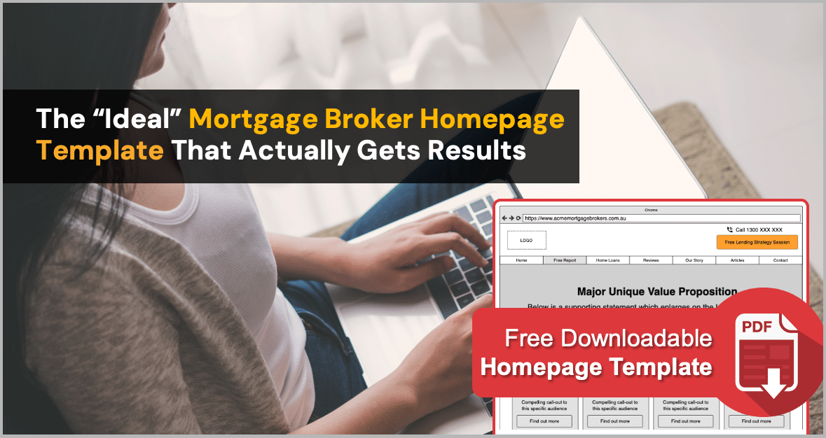
First, grab the wireframe here, then keep reading below for an explanation of the key elements:
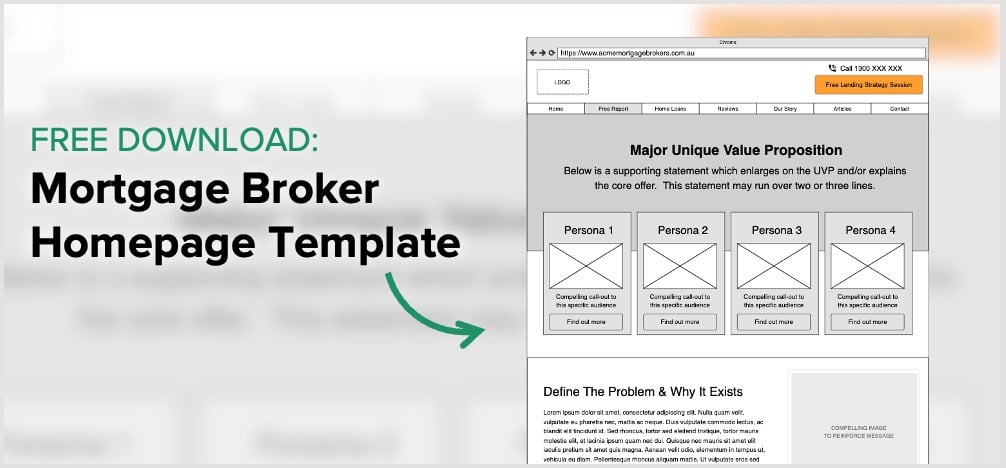
9 Elements Of A Highly-Effective Mortgage Broker Homepage
1. Persistent Call To Action
There is nothing more frustrating than landing on a website homepage and not knowing how to contact the business. That’s why it’s essential to display your phone number in a prominent position where people are most likely to look: the top right-hand corner.
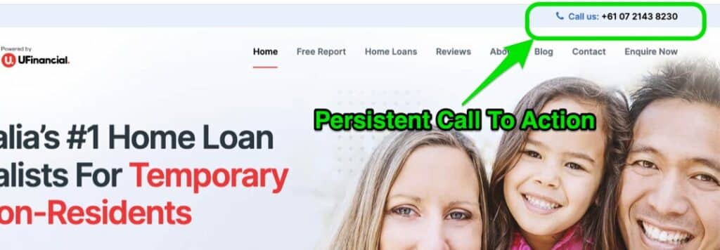
Repeat your phone details in the footer at the bottom of the page. And scatter other Calls To Action (e.g. free consultation, free discovery session, free borrowing calculator, free report) throughout the page.
Use a font and colour that makes your phone number easy to read. And be sure to create Call To Action buttons in contrasting colours so they stand out and encourage readers to click them.
2. Clear Navigation
The internet has made us impatient. If readers don’t find what they want on your homepage in seconds, they will click the back button and be gone for good.
Make it easy for visitors to find the information they are looking for by having clear navigation. Although some homepages are now opting for a Hamburger Menu (icon of 3 horizontal lines that opens to a full menu when clicked), a traditional navigation bar at the top of your homepage is a proven way to display the content of your website.

If you offer multiple services or cater for different personas, you can feature them in a drop-down menu grouped under main navigation headings (e.g. First Home Buyer and Property Investor can be grouped under a navigation heading for Home Loans).
Your navigation bar should also include resources like Free Reports and Blog Articles, Reviews and Case Studies, and calls to action like Contact or Enquire Now.
3. Free Download (or Lead Magnet)
For every 100 interested, qualified prospects who visit your homepage, only 4%-7% are ready to enquire straight away. The vast majority are just researching their options.
Naturally, you must do all you can to compel ready buyers to contact you. But ignoring the other 93%-96% is literally throwing money away.
Instead of turning them away, try meeting them where their current needs are.
Offering a Free Download (known as a Lead Magnet) positions you as an expert (just like an author), gives people the research information they want, and enables you to follow up (especially through email) until they are ready to become a client.
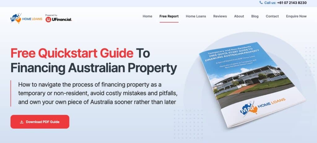
Don’t skimp on your Free Report. Make it so valuable that prospects would pay money to get it. And make it aligned to your brand and Unique Value Proposition (UVP).
4. Unique Value Proposition (UVP)
Many mortgage brokers make the mistake of trying to convince people they need a mortgage broker. But that’s like wasting time telling someone who just walked into a car yard they need to buy a car. They already know that – that’s why they went to a car yard.
70%+ of Australians already use a mortgage broker when buying a home. So rather than wasting time convincing them of what they already know, get straight into answering the top 3 questions that are on their mind when they arrive on your homepage:
- Is this for me (specifically)?
- How will it help me?
- What do I do now?
The quickest way to do this is with a well-crafted Unique Value Proposition that sets you apart from every other ‘me too’ Mortgage Broker and lets your prospect know you have the answers they’ve been looking for. See below for an example:
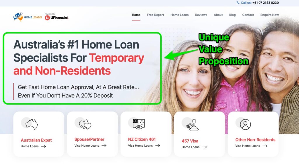
| Is this for me (specifically)? | Temporary and Non-Residents looking for a home loan (even if you don’t have a 20% deposit) – yep, that’s me – right there in the red text! |
| How will it help me? | Fast approval and a great rate – yep, that’s exactly what I want! |
| What do I do now? | Click for more specific information relevant to my situation – great, here’s the exact information I’m looking for! |
5. Personas
Almost every business leader warns about the dangers of trying to be everything to everybody and instead urges to focus on a niche market.
“Find a niche, not a nation”
– Seth Godin
That doesn’t mean your niche has to be so narrow you can only serve one type of client. But it does mean you should only speak to one type of client at a time. And that’s where personas come in.
While your homepage (and especially your UVP) speaks to your broad niche, your persona pages speak to sub-categories in ways that resonate with their specific problems and desires. While the general information may be similar, the specific language and even the photos you choose help people to know, “This is for me!”
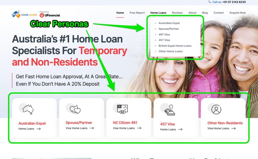
As you can see on the MAP Home Loans website, my broad market is “Temporary and Non-Residents”. This is further split into several personas:
- Australian Expat
- Spouse/Partner
- NZ Citizen 461
- 457 Via
- Other Non-Residents
This enables me to address specific classes of visas (and their requirements), LVRs for different types of borrowers, and even the specific pain points for people who have been knocked back for a loan (and what I can do to help them get approved).
Although the focus of my MAP Home Loans website is Temporary and Non-Residents, that doesn’t mean I can’t help other types of clients. In fact I do. But rather than trying to make this website all things to all people, I address other markets with other websites:
- Professional Home Loans: With personas including Doctors, Dentists, Pharmacists, Vets, Nurses, Psychologists, Legal Professionals, Accounting & Financial Professionals and more.
- Building Loans Australia: With personas including Land Loans, House and Land Packages, Construction Loans, Investment Construction and more.
This enables me to speak to each type of client in a way that resonates with them, so they naturally conclude I am the perfect choice to help them.
6. Problem, Agitate, Solve
One of the most famous and effective homepage copywriting formulas is PAS: Problem, Agitate, Solve.
Problem:
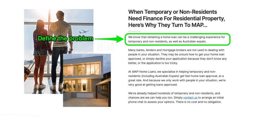
Identify the problem/s the prospect is experiencing. Where possible, use the exact words the prospect uses to describe their current situation. In The Robert Collier Letter Book, the author calls this “entering the conversation already taking place in the customer’s mind.” And as a bonus, when you can explain the prospect’s problem better than they can, they’ll immediately assume you have the best solution.
On my homepage, this involves repeating who the reader is (Temporary or Non-Residents and Australian expats looking for finance) and empathising with their struggle to obtain a home loan.
Agitate:
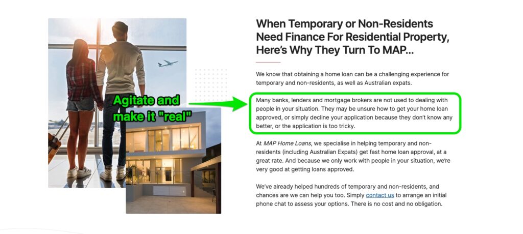
Agitate the extent of the problem/s and the cost of leaving them unsolved. It’s like pouring salt on the wound. It may hurt a little, but it’s the surest path to healing. Show a little humanity too by expressing empathy for the pains and frustrations the prospect is experiencing. Remind them that they are not alone, and you know how they feel.
Notice how I also differentiate my firm by explaining how other lenders and brokers, “… are not used to dealing with people in your situation.” And how they may… “simply decline your application because they don’t know any better, or the application looks too tricky.”
This agitation gets your prospect thinking, “What hope is there?” And that’s when you present the solution.
Solve:
Present your product / service as the most viable solution – the quickest, easiest, best way to make everything better and get them the ultimate result they are looking for. Be sure to be congruent with your UVP. And speak directly to your ideal personas.
Here is where I differentiate my firm through our special experience in helping the exact reader (temporary and non-residents). I show continued empathy for their challenges, “… not always in a position to supply a 20% loan deposit.” And I assure them of our success at getting fast approval, at the best interest rate, resulting in thousands in savings.
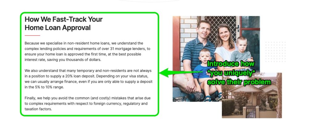
Finally, I deal with a couple of common objections including our experience in avoiding, “… common (and costly) mistakes that arise due to complex requirements with respect to foreign currency, regulatory, and taxation factors.”
Then simply insert a Call To Action to help your prospect take the next step.
7. Benefits
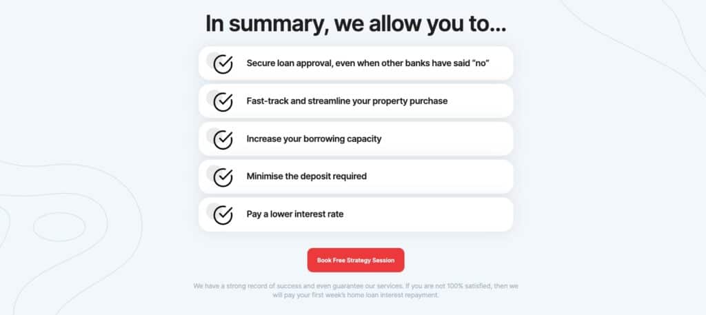
Here’s where you explain not merely your features (the things you do), but the benefits (the results your clients get working with your firm).
Features = things
Benefits = results your clients get from those things
On my homepage, you’ll see I don’t dwell on things like number of staff, operating hours, network of lenders, office systems etc. (features). Rather, I highlight the most desired results (benefits) my clients are looking for including approval when they’ve been knocked back, ability to purchase property faster, access to more money with less deposit, and a lower interest rate.
8. Social Proof
In his book, Influence, Robert Cialdini explains, “… one means we use to determine what is correct is to find out what other people think is correct.”
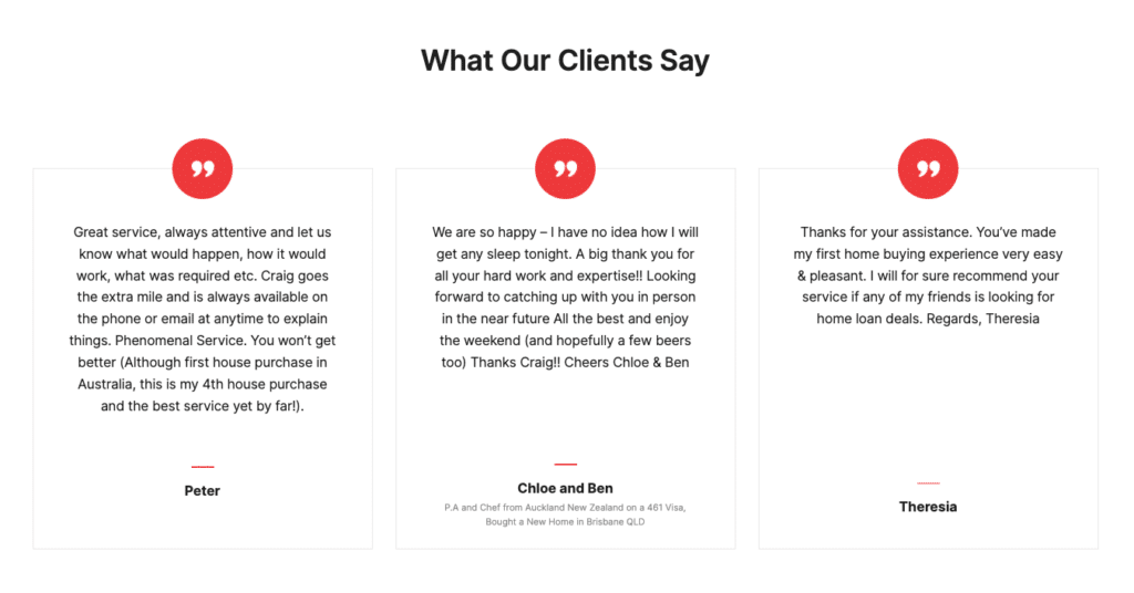
People don’t like to be the odd one out – we prefer to follow the crowd. One of the best ways to add social proof to your website is through testimonials. In his book, Confessions of an Advertising Man, David Ogilvy said, “You should always include testimonials in your copy. The reader finds it easier to believe the endorsement of a fellow consumer than the puffery of an anonymous copywriter.”
The most effective testimonials build a common bond with the reader and help them imagine (and believe in) the future you can give them:
| BEFORE Using Your Firm | AFTER Using Your Firm |
| Declined again and again | Approved first time |
| High rate and fees | Low rate and fees |
| Missed out on dream house | Got dream house sooner |
| Stressful process | Easy and enjoyable |
| Ongoing dramas | Set and forget |
Effective testimonials don’t merely tell stories about your current clients. They help your future clients imagine themselves in the stories because they:
- Represent the Reader: Real stories of people just like them (similar background, identical struggles, same desires). Be sure to include the name of the client. And where possible include a photo and other details like suburb and type of loan.
- Use Natural Language: Never industry jargon – only the real conversation going on in the mind of the client (and prospect). And don’t worry about incorrect grammar and typos – they only add to the authenticity:
- Mention Specifics: Including exact timeframes and savings (the more specific the better) to explain why the writer thinks your service was so good.
- Focus On One Thing: It could be challenge you helped them overcome, a benefit you helped them enjoy, or the answer to an objection that made them glad they engaged your services.
Another way to add social proof is to demonstrate your experience by including proof of your strong network of lenders. This doesn’t offer the same level of proof as testimonials. Nor does it do much to differentiate your firm (as most brokers display lender logos). However, it does reinforce the feeling that the reader is in the right place.

9. Call To Action (CTA)
You’ve made it clear you understand your prospect’s challenges. You’ve proven you have the expertise to solve their problems and give them the outcome they want. Now it’s time to invite them to take the next step so they can start enjoying the benefits.
This is primarily done through a Free Consultation (or similarly worded meeting, such as a Strategy Session, Borrowing Assessment etc.).

Like I have, you may soften the language with words like “exploratory” or “initial chat”. Reinforce the major benefits (e.g. fast approval with a competitive rate). And bolster their confidence by mentioning one of their concerns (e.g. even if you don’t have a 20% deposit).
Conclusion And Next Steps
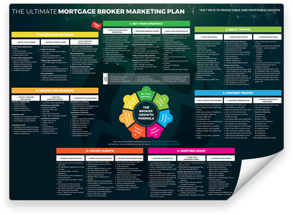
For more tips on how to improve other areas of your website and marketing, take a look at The Ultimate Mortgage Broker Marketing Plan 2.0 (including free downloadable wall chart). And when you’re ready to optimise results from your extra lead flow (while working fewer hours), click here to check out the latest demo of BrokerEngine software.


